
What is Drift?
Drift, a B2B company, facilitates connections between
businesses and prospective customers when their intent to buy is at its highest. By linking
Sales Representatives with visitors when they're exploring pricing options and offering
insights into their browsing behavior, Drift enables personalized sales. This approach
leads to quicker and more effective sales.
What did I do?
To address low Drift Mobile usage, I conducted extensive user research and created a fully functional prototype in Figma. Through 12 in-depth interviews, I identified missing features that prevented more widespread Drift Mobile adoption. My insights drove increased usage, enabling sales teams to engage high-intent customers.
Product Designer
Three Months
Taylor Wagner — Manager
Shelton Miller — Product Manager
Ahmad Alhayek — Mobile Software Engineer
The Drift Mobile app lacked essential functionalities expected by sales associates. Sales opportunities can arise at any moment, even while waiting in line at the grocery store. Without the features available to them on desktop, sales teams have a harder time addressing customer needs.
I determined that core functionalities, such as slash commands and saved replies, were missing. I created a fully functional prototype to how these features could be optimized for mobile.
After extensive rounds of exploratory user interviews, a presentation on my findings, a fully built prototype with multiple rounds of critique, and usability testing, I addressed a wide variety of issues faced by sales development representatives.
During the user interviews I conducted, I found out Drift Mobile was missing many features from Drift Desktop, leading to a lack of use. I looked at usage data to see what the most used features were and made those easiest to access via the actions bar.
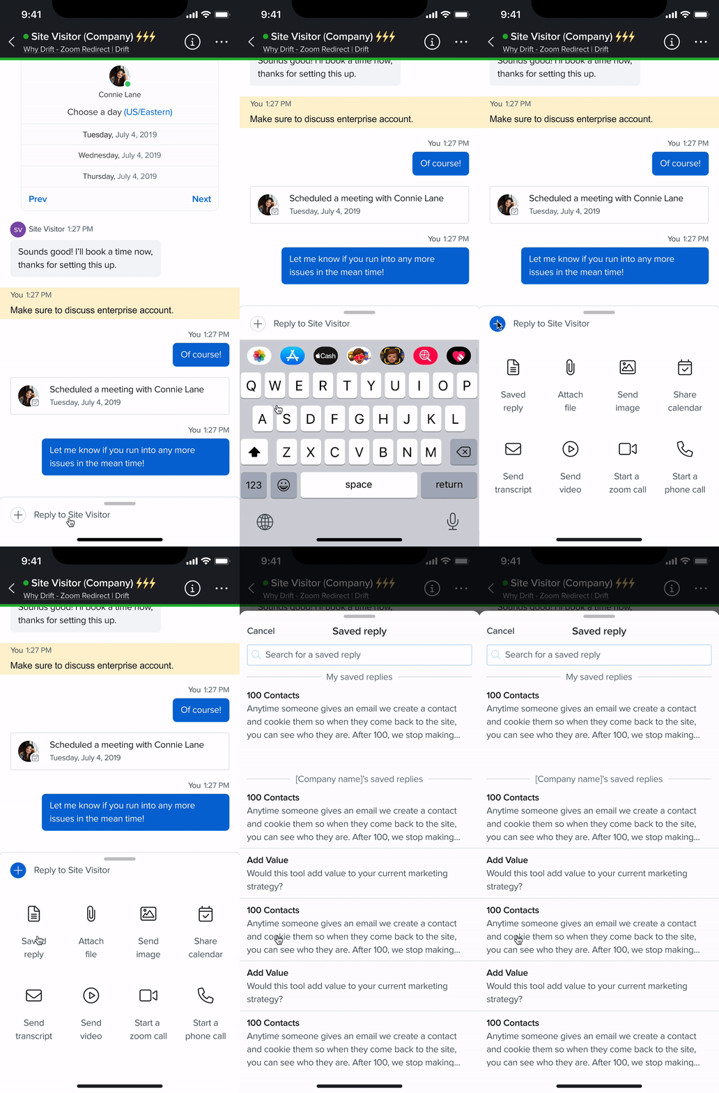
The sales team frequently relied on crowd-sourced openers and responses, a feature notably absent on mobile but heavily utilized on desktop. I introduced a solution that allows users and companies to save their preferred replies, providing convenient and quick access
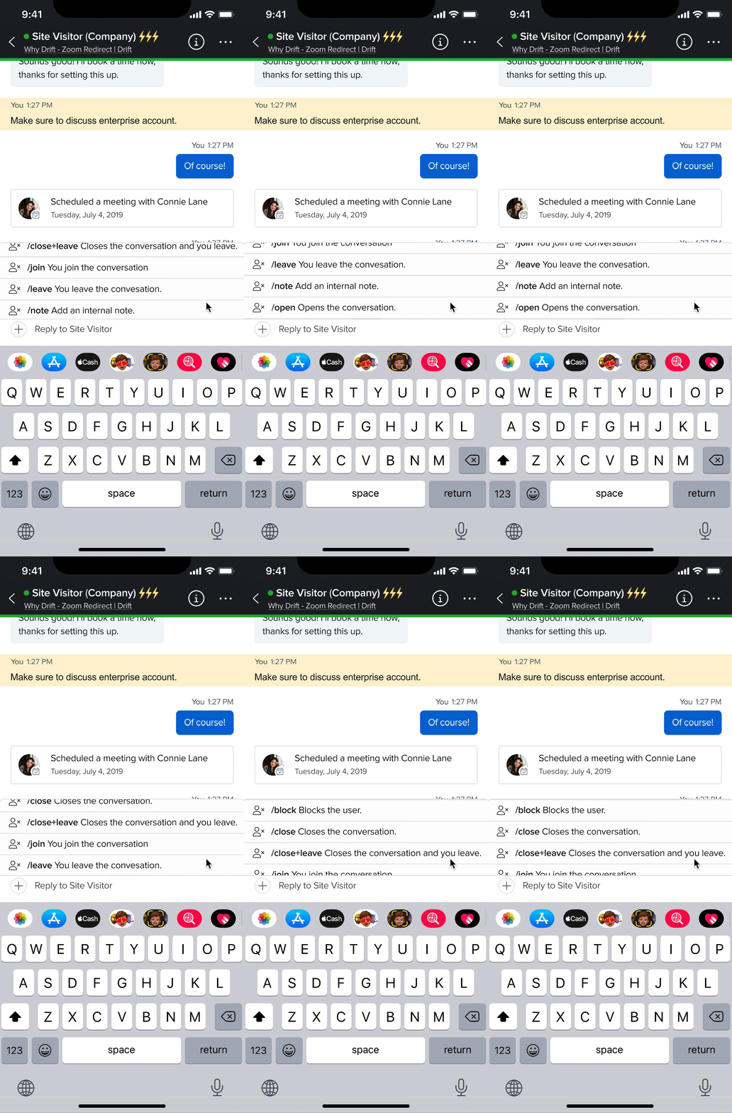
Every single day, hundreds of thousands of slash commands are used on Drift Desktop. Yet, this functionality is not available on Drift Mobile. This feature helps users quickly access key information. Without it, the process of making a sale is much slower. In order to prevent this issue, I added this functionality to Drift Mobile.
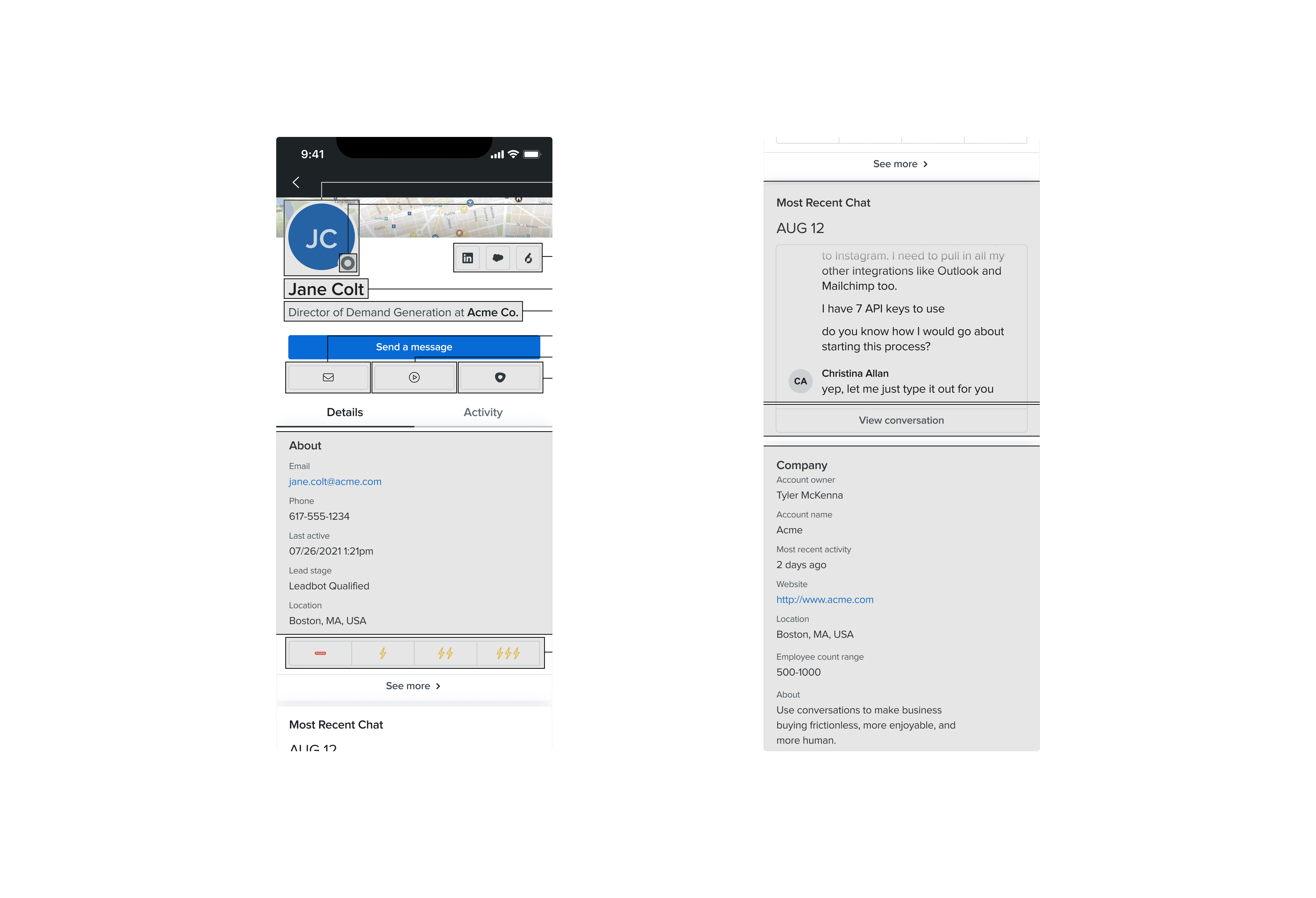
Understanding the customer is a key component to making a sale. If you can understand the needs of the customer, you can sell them what they want quickly. On Drift Desktop, it's easy to see the entire account's history in order to decide the next move. However, on Drift Mobile, this view is much more complex. I simplified this view in order to make it easier to parse intent.

"What typically prompts you to open Drift Mobile?"
"Why do you decide to open Drift Mobile instead of Drift Desktop?"
"Can you walk me through what you do when you decide to open Drift Mobile?"
"Is there anything that prevents you from utilizing Drift Mobile?"
While many Sales Development Representatives use a queue or round-robin system to allocate customers, those utilizing "first come, first serve" know that being there first is vital.
Sales Development Representatives often chose the Desktop App over Drift Mobile when nearing a sale. They found Desktop more reliable and were concerned about Mobile's limitations.
Many people who I spoke to were Desktop-only users and had never heard of the Drift Mobile app. This highlighted the necessity for improved advertising to engage and rekindle interest among those who hadn't considered or previously dismissed Drift Mobile.
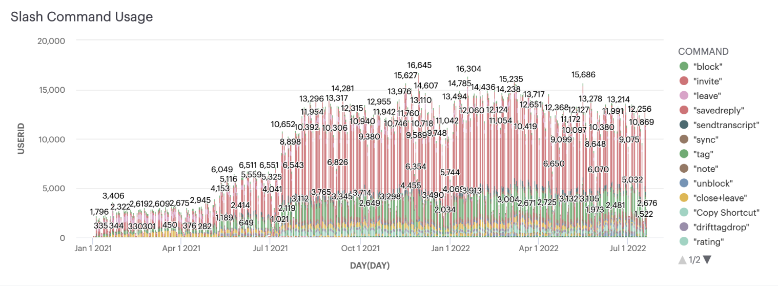
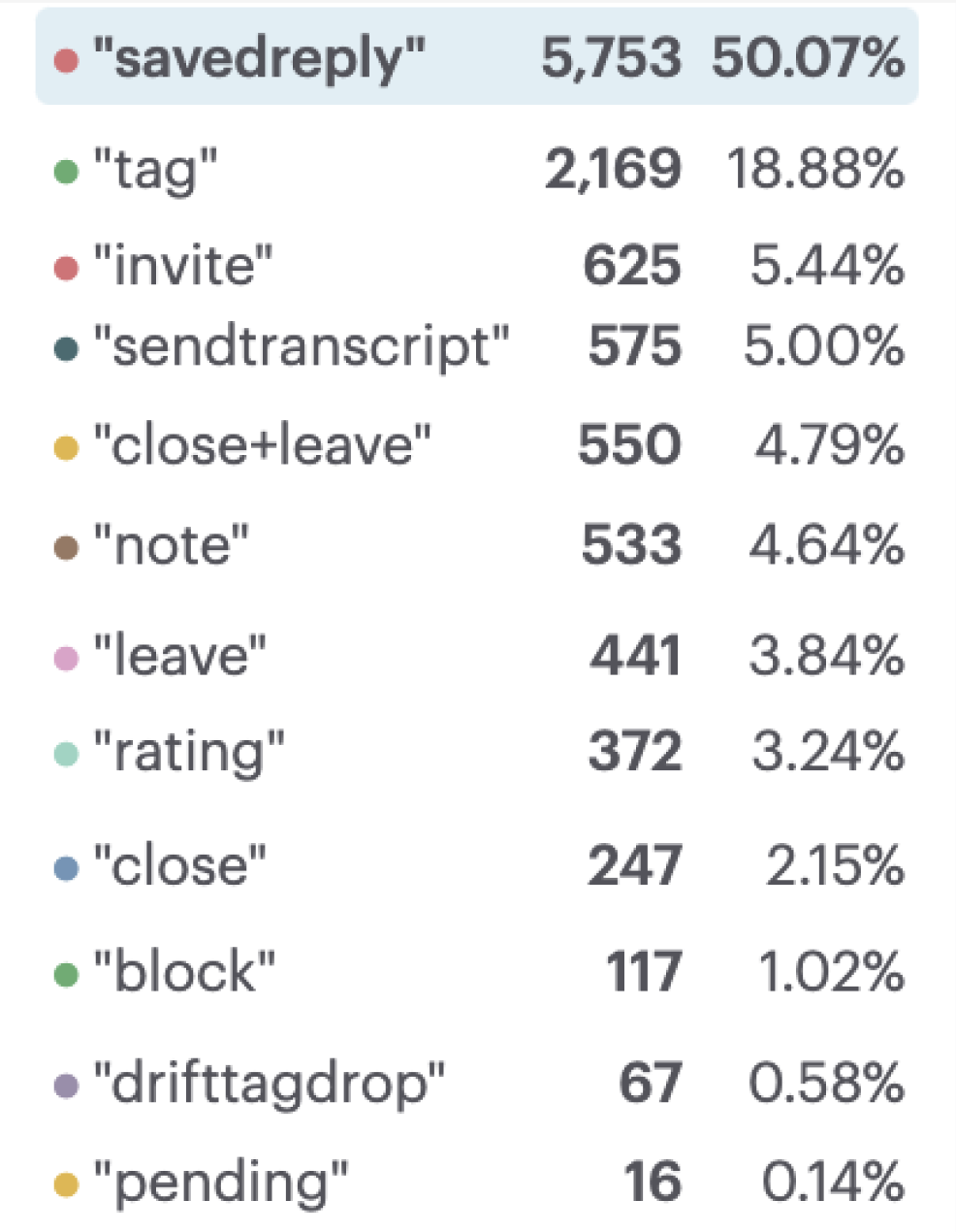
Just in the Drift instance, there were around 12,000 uses of /savedreply every single day! Beyond this, slash commands as a whole were not available on mobile. This is notable because slash commands allow representatives to get tasks done quickly and as I had discovered, speed is important. This guided my decisions moving forward into the design phase.
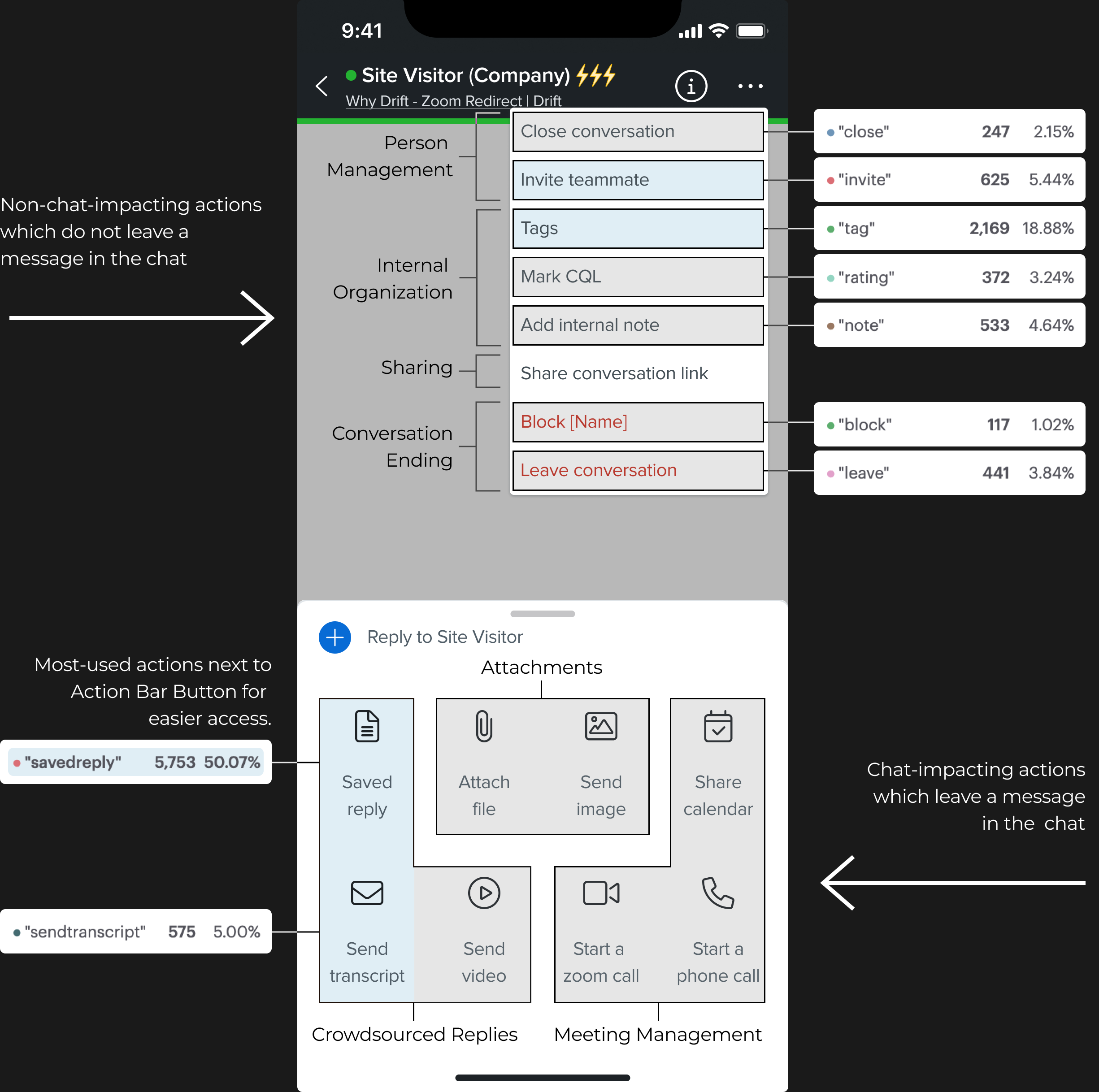
Based on my research, I realized there was one key difference between the different
actions users can
take. Their actions either appear in chat and are visible to the customer, or the action does not
appear
in chat and is invisible to the customer. This is an important distinction to make for
representatives
because it tells them what is and is not visible to their customer.

Action Bar

Option Menu
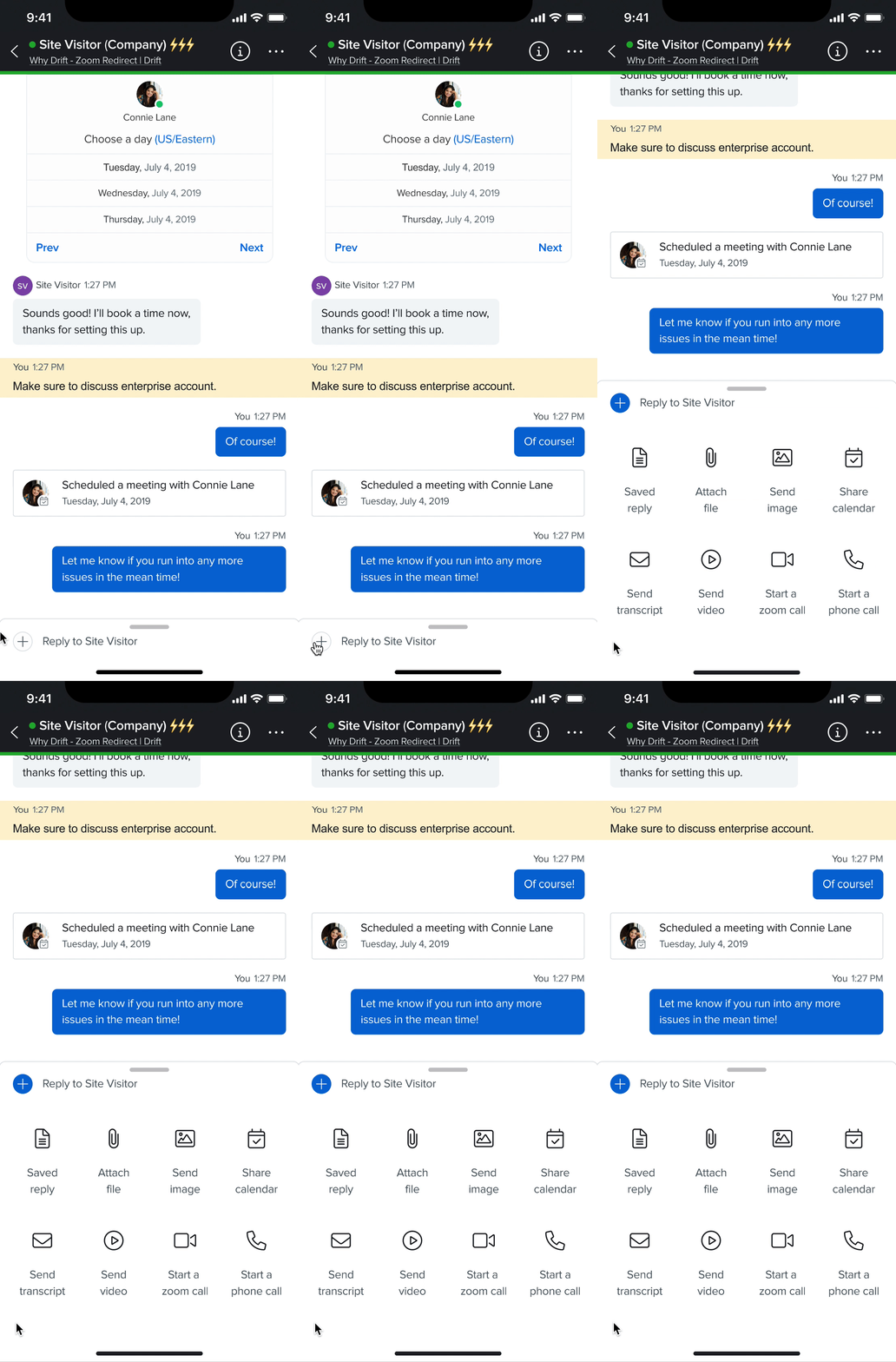
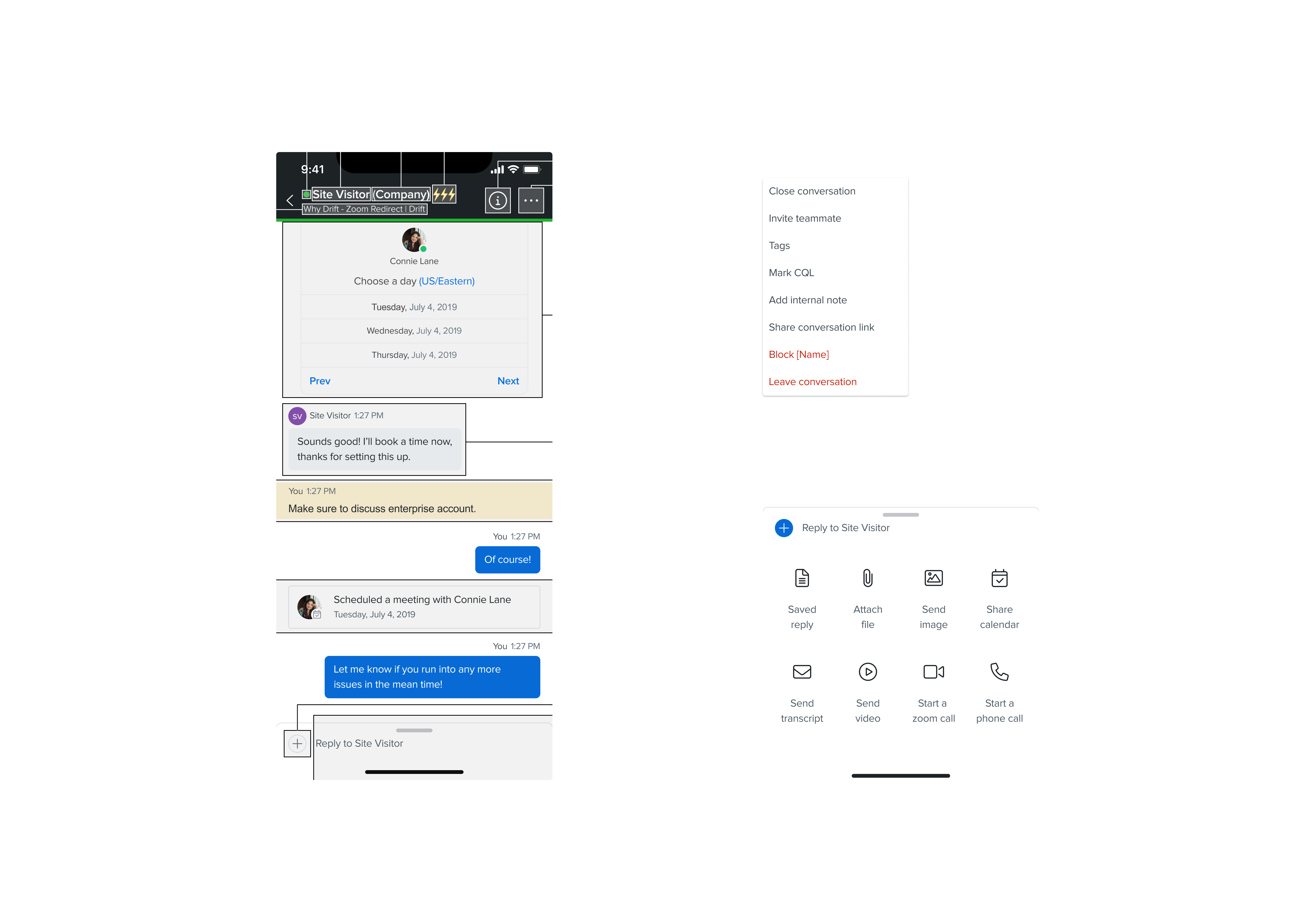
The finalized version of the Action Bar and Options Menus give users the ability to perform typical Drift Desktop actions on Drift Mobile! Now, Sales Development Representatives won't be rushing back to the computer to finalize sales. With the most frequently used features in mind, these screens are organized to make the path from Point A to Point B as short as possible.
Many Sales Development Representatives frequently rely on crowdsourced responses, videos, and often share conversation transcripts as part of their workflow. These actions are designed to enhance their productivity and are the most commonly used features. That's why I've placed these options right below the action bar button for quick access. These actions enable representatives to leverage pre-existing responses that align with their company's sales strategy, as well as save and send messages that have proven effective.
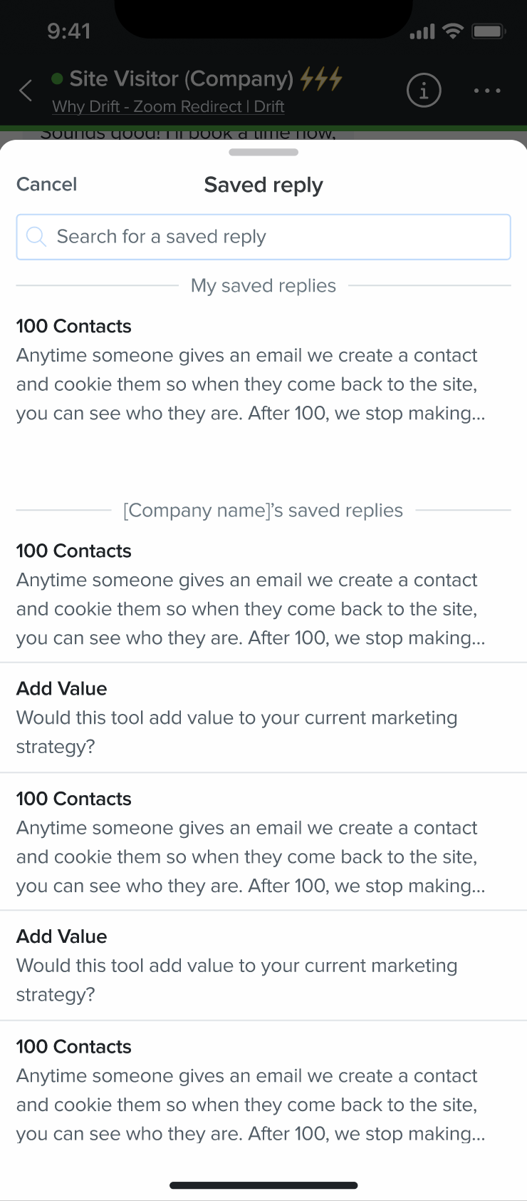
Saved Reply
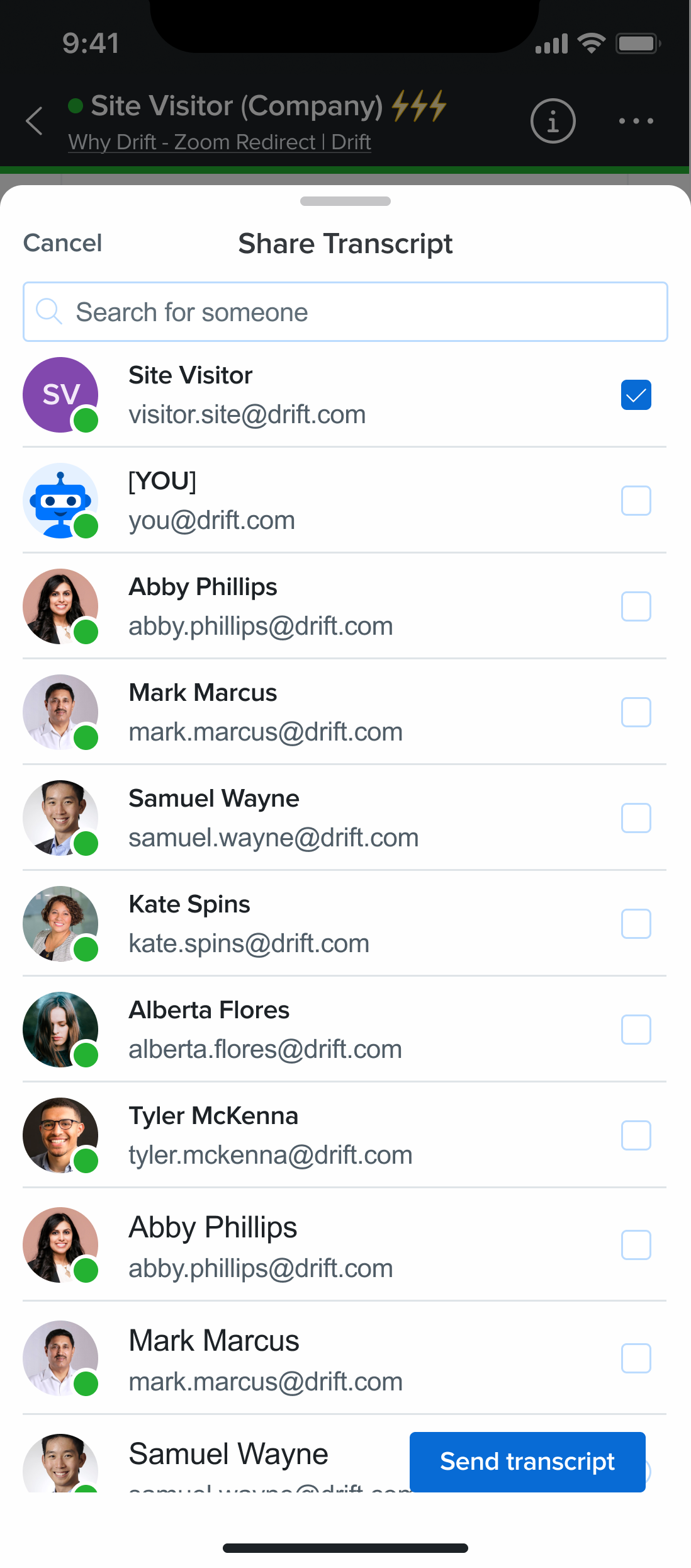
Share Transcript
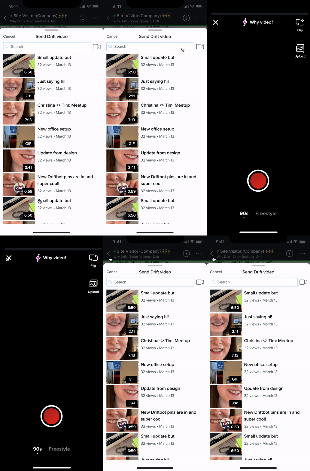
Send Video
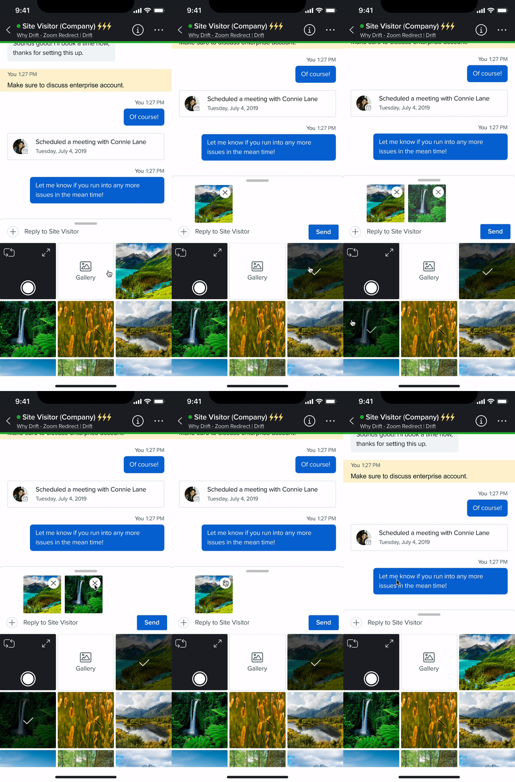
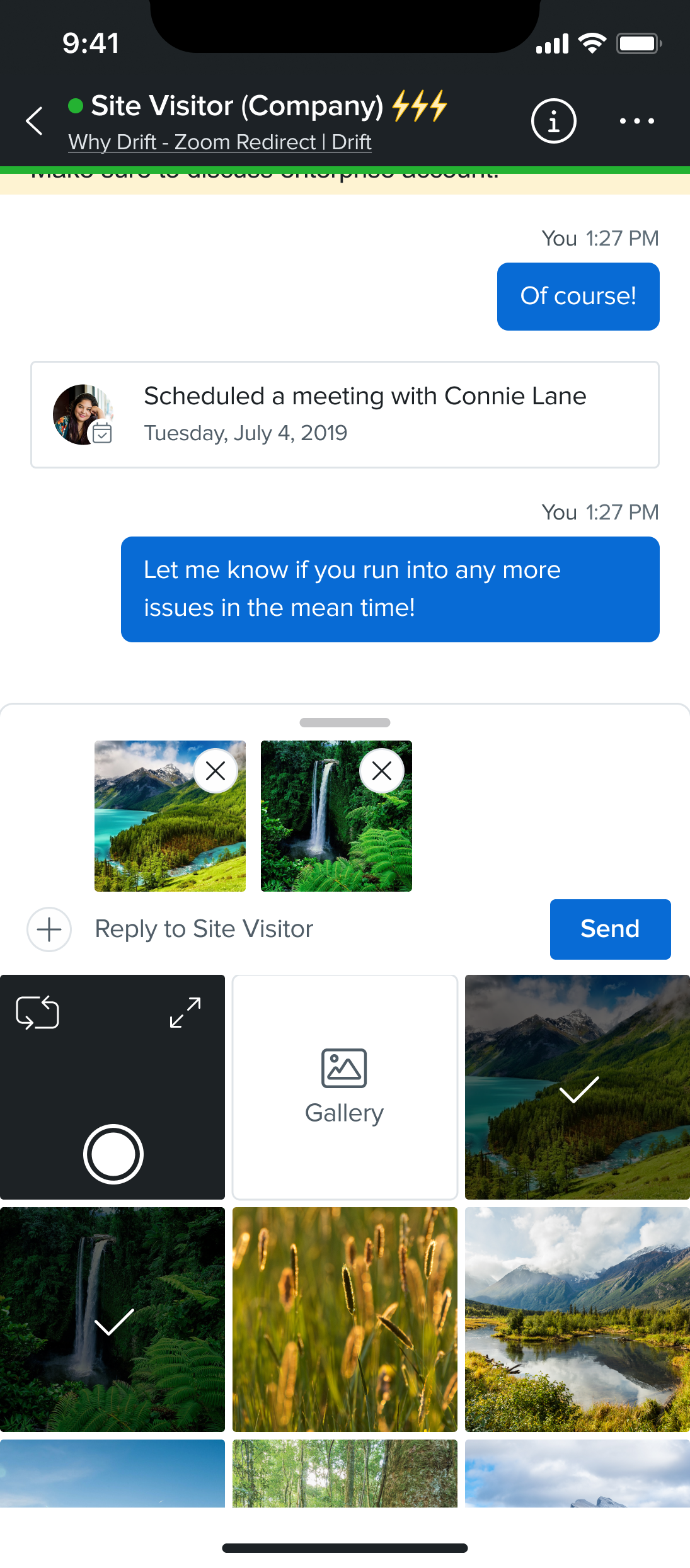
Send Image
While the file and image sharing feature may not be widely utilized, there are instances where some representatives find it necessary to send files or images to potential clients. This capability is also a common feature in other mobile chat platforms and is readily available on Drift Desktop. To ensure that representatives have a consistent experience across both Drift Mobile and Drift Desktop, I have incorporated this feature into the design.
One of the most exciting time for a representative is when they've successfully validated a lead and sense the opportunity for a potential deal. This is where the ability to schedule a meeting on the calendar, initiate a Zoom meeting, or make a phone call becomes crucial. Ensuring that these features are accessible on mobile is not only vital for Sales Development Representatives but also for Customer Service Representatives, enabling them to kickstart a call at any given moment.

Share Calendar
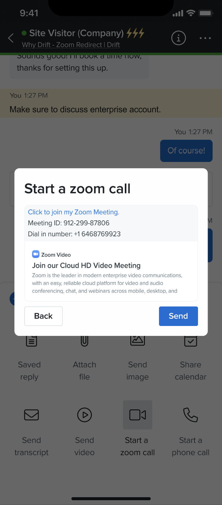
Zoom Call
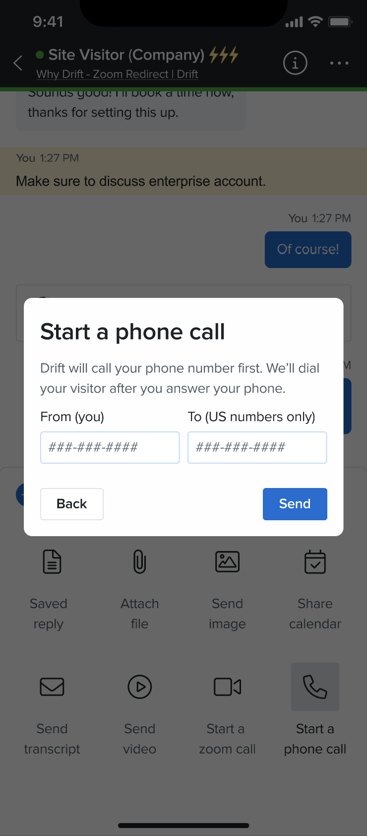
Phone Call
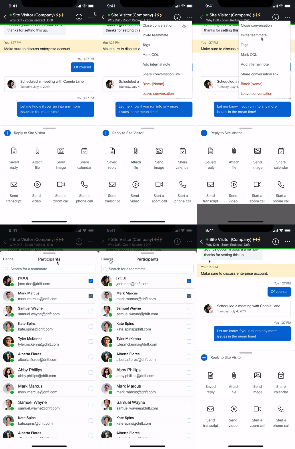
Invite Teammate
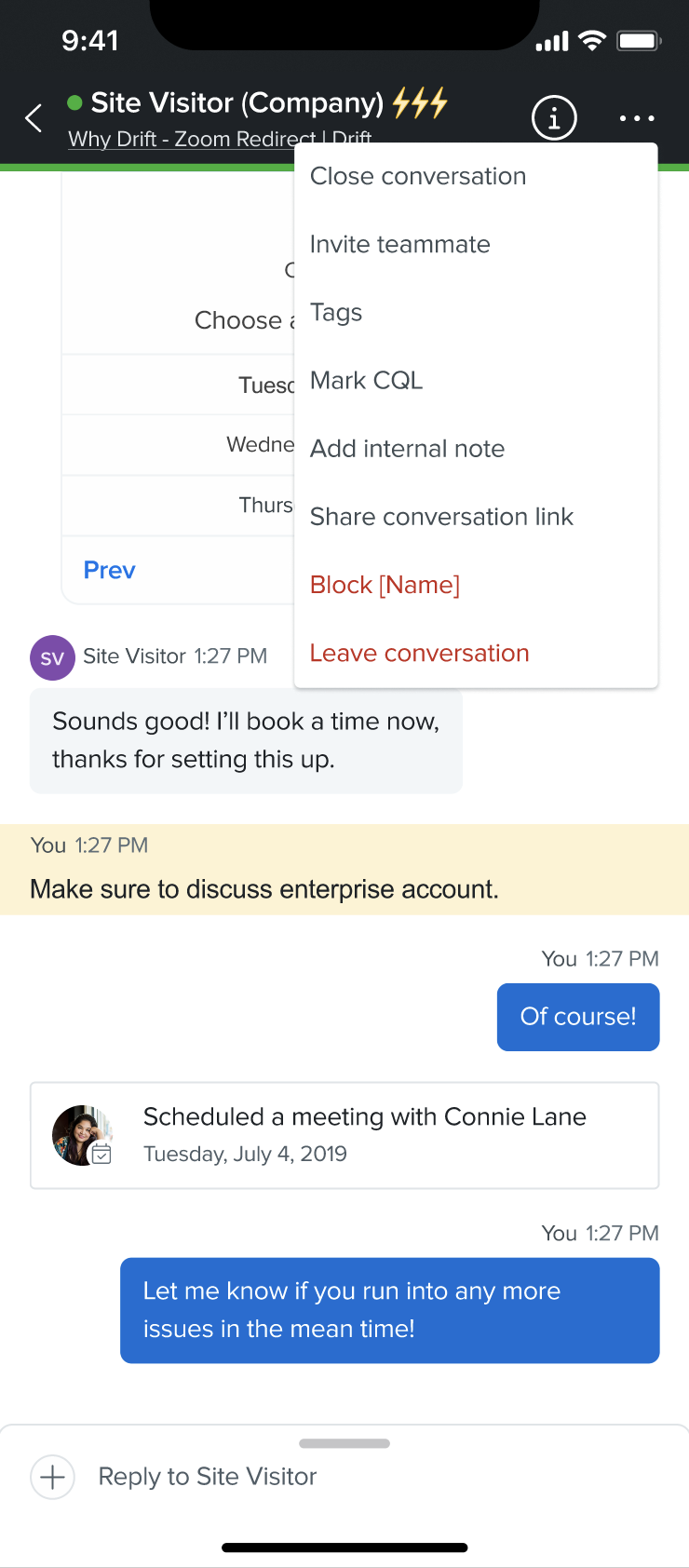
At times, Sales Development Representatives might find themselves engaging with a chat participant who falls outside their designated territory or target company size. In such situations, they may opt to involve a colleague and close the conversation, facilitating a more effective sales experience. Hence, the inclusion of an 'invite teammate' and 'close conversation' option are important.
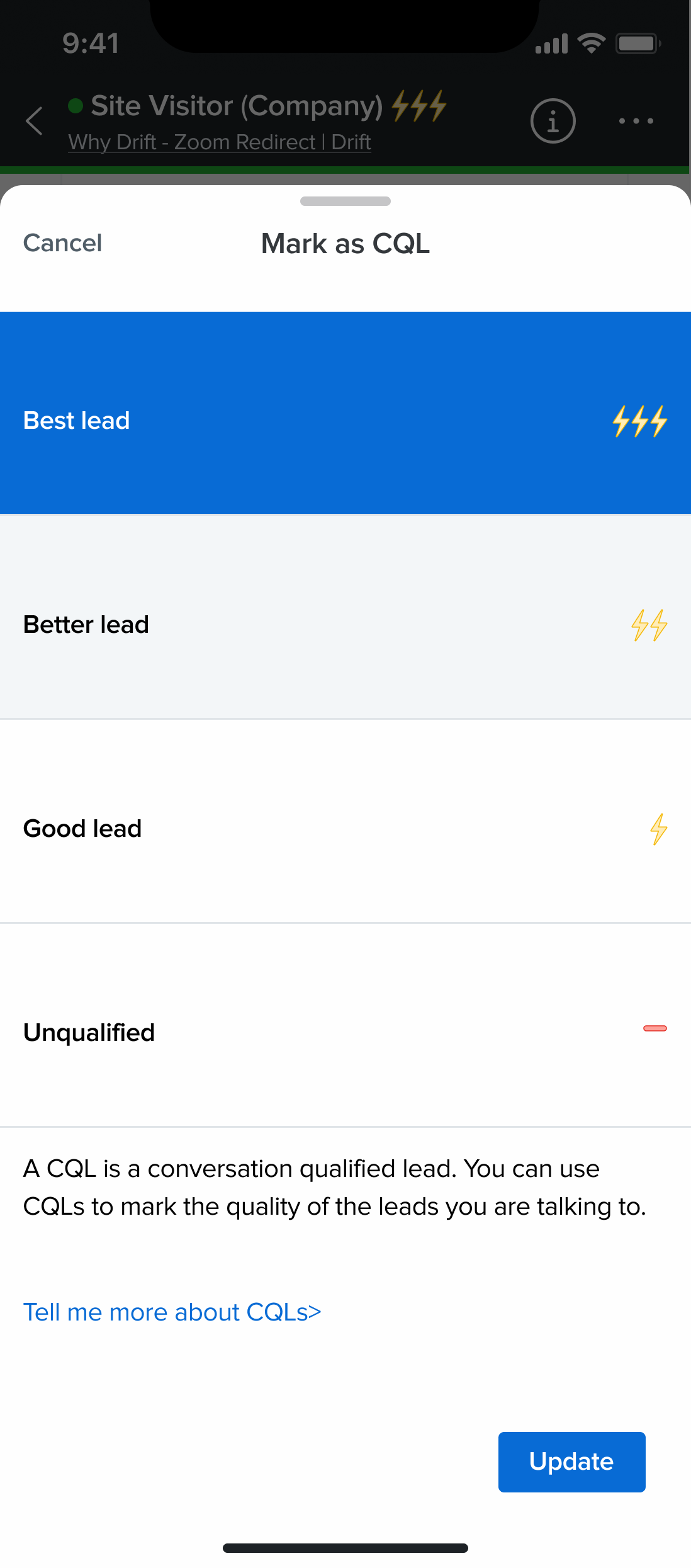
Many representatives routinely tag conversations, label their CQL (Community Qualified Lead), or add internal notes. These actions are helpful to both the individuals handling the conversation and their colleagues, fostering collaboration and keeping everyone on the same page. This information is readily accessible on the account profile. Additionally, representatives have the ability to filter conversations based on specific tags or CQL, further enhancing their efficiency.
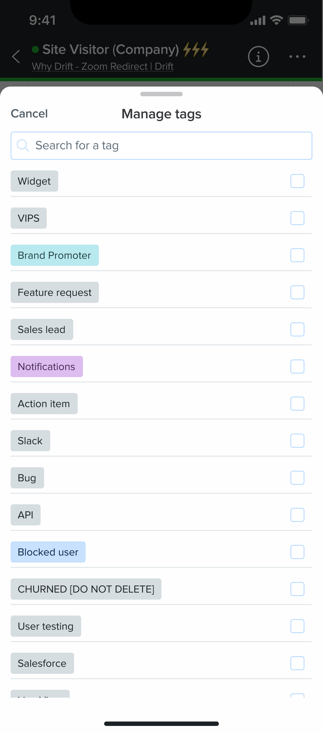
Tags

Mark CQL
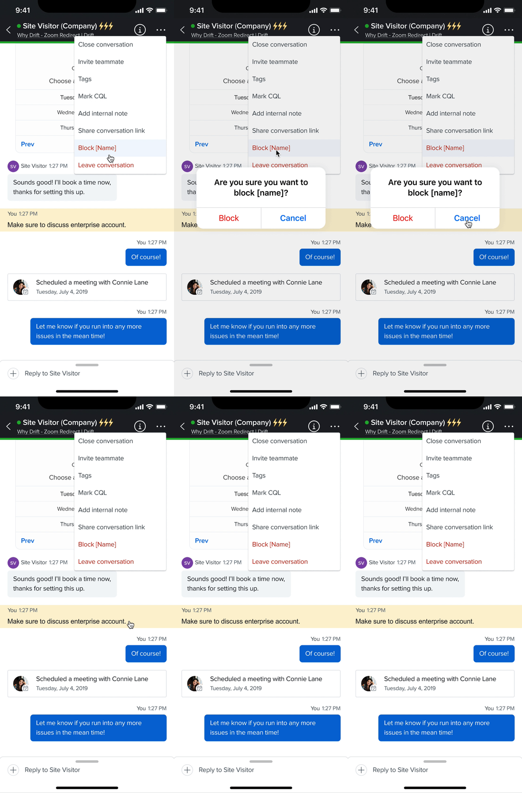
Block
It's a common occurrence for representatives to come across individuals who just want to waste their time. In fact, during my conversations with representatives, they shared some of the funniest messages they've received from people online. In these scenarios, blocking and leaving the conversation is typically the best course of action. These options are located at the bottom of the menu.
Slash commands are one of the most frequently used features on Drift Desktop. Therefore, it was important to ensure their availability on Drift Mobile. In the process of implementing them, I drew inspiration from popular apps such as Slack and Discord to ensure that the options are presented in a clear and user-friendly manner, making them easily readable and selectable.

Slash Commands
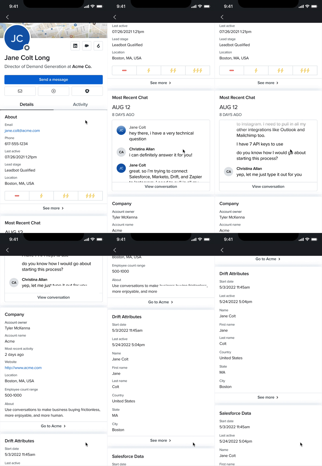
Contact Profile

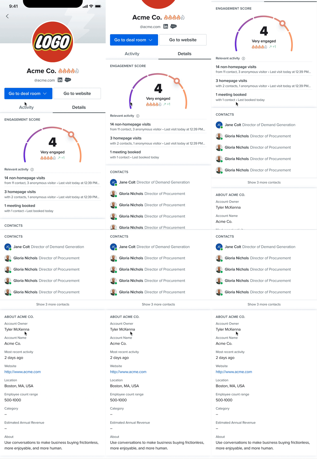
Account Profile
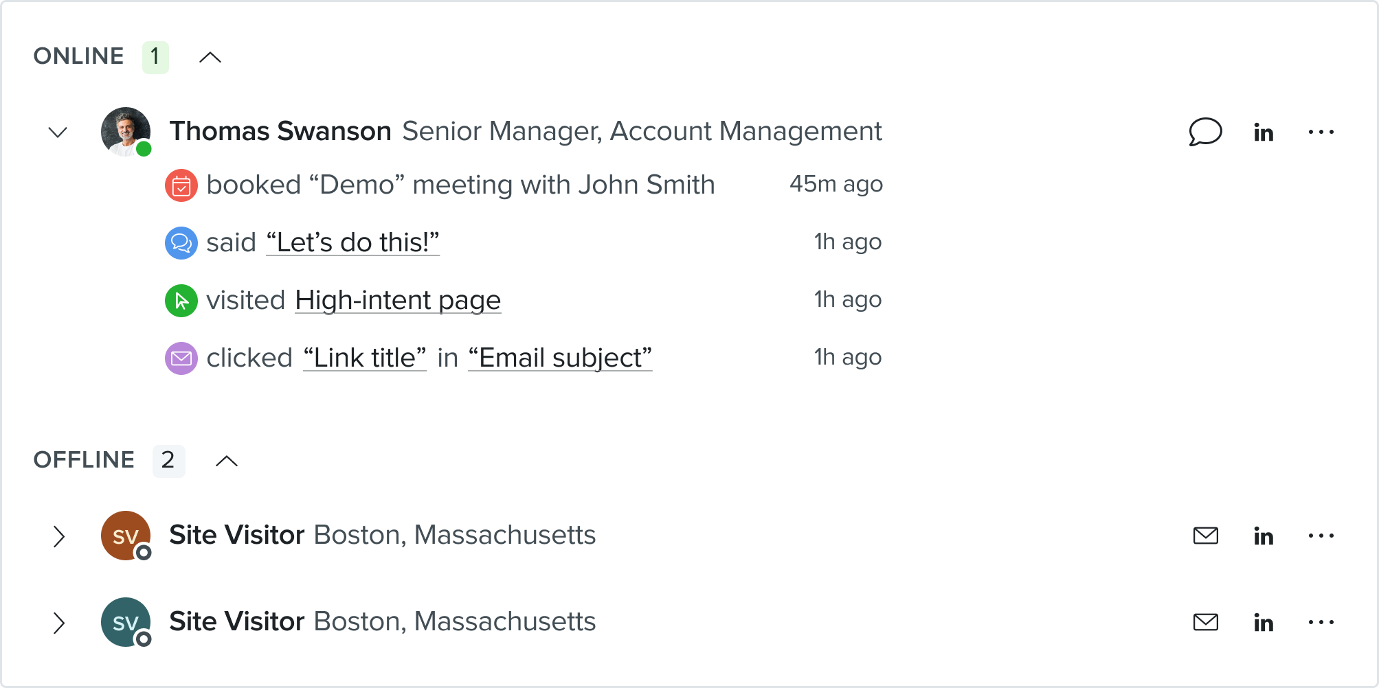
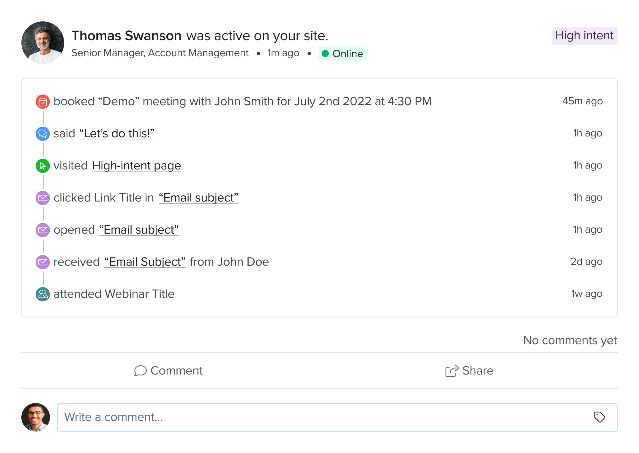
In order to make the most intriguing deal possible, it's important to gain insights into the individuals and companies you are selling to. Drift facilitates this process by aggregating all interactions from both individuals and companies visiting your site, and then extracting key insights. This feature is now available on Drift Mobile.
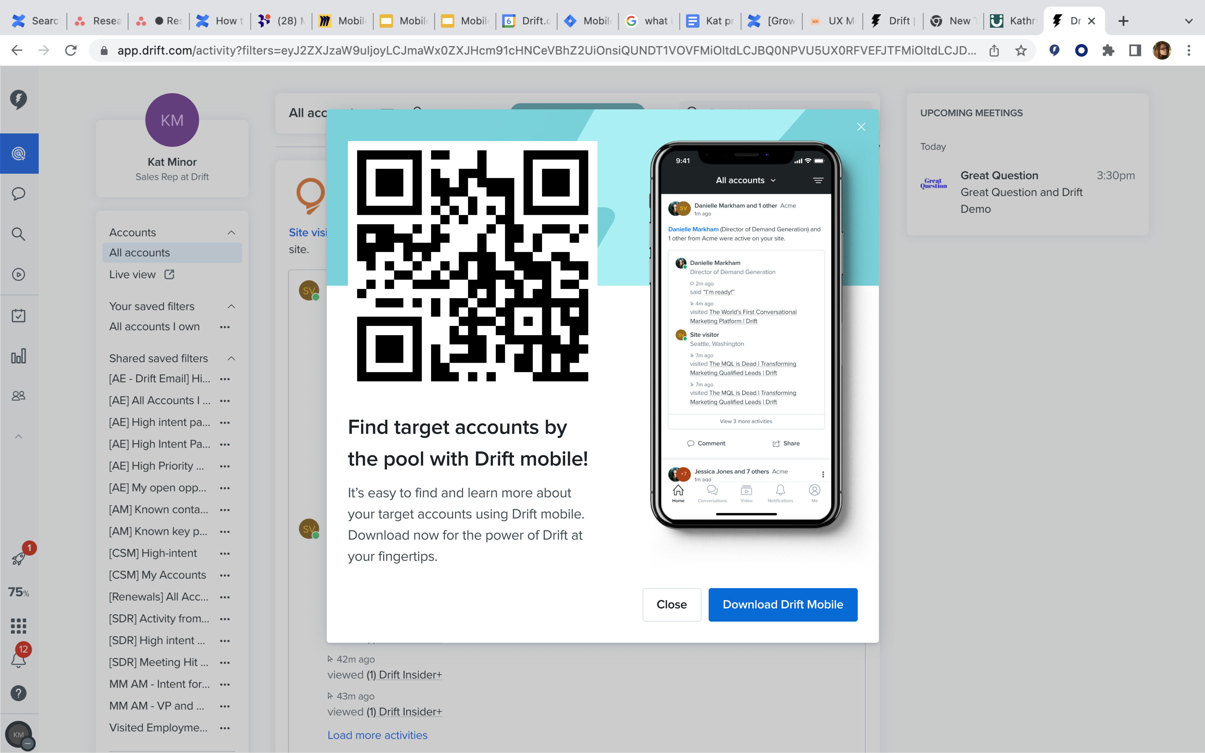
The Feed
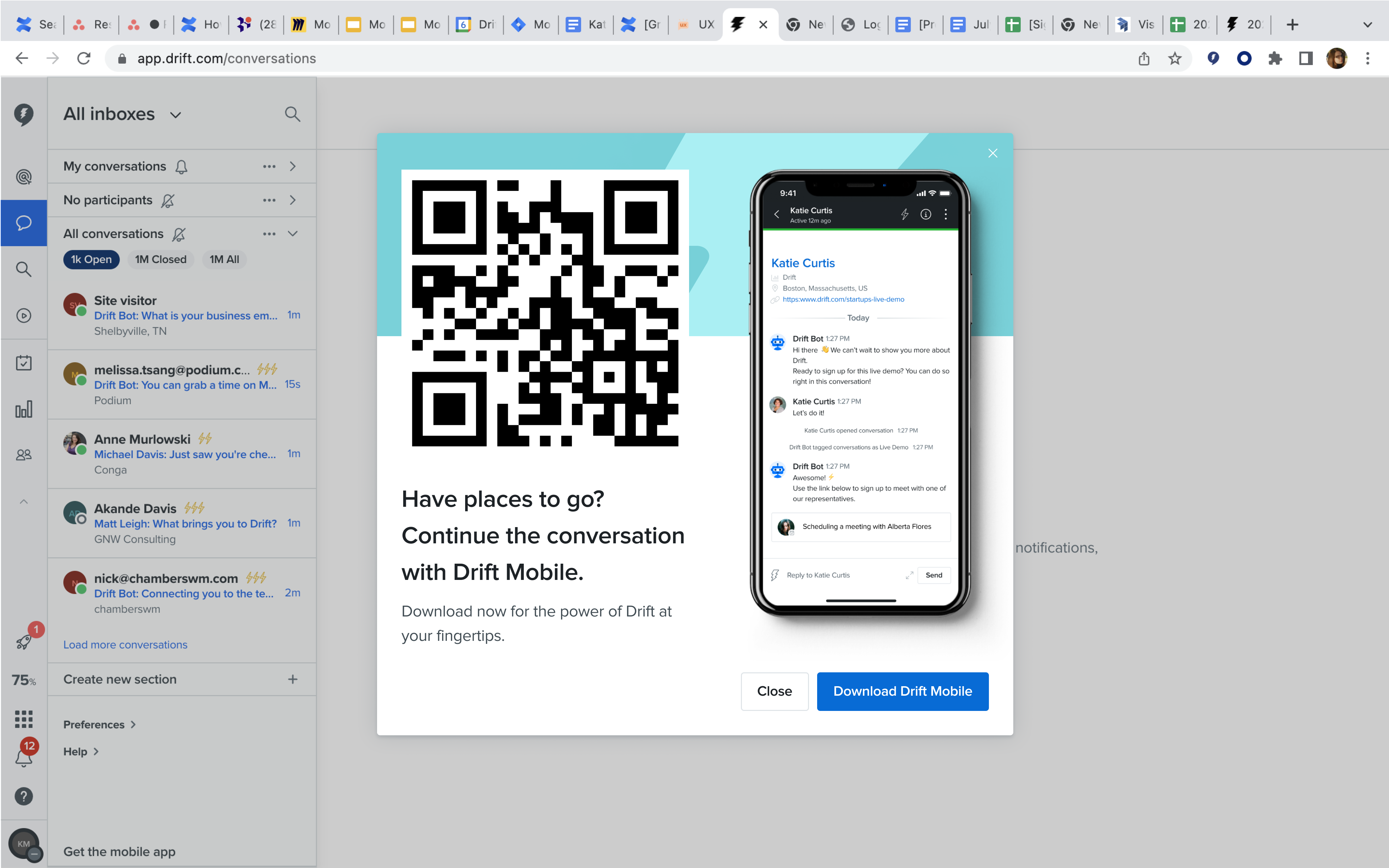
Conversations
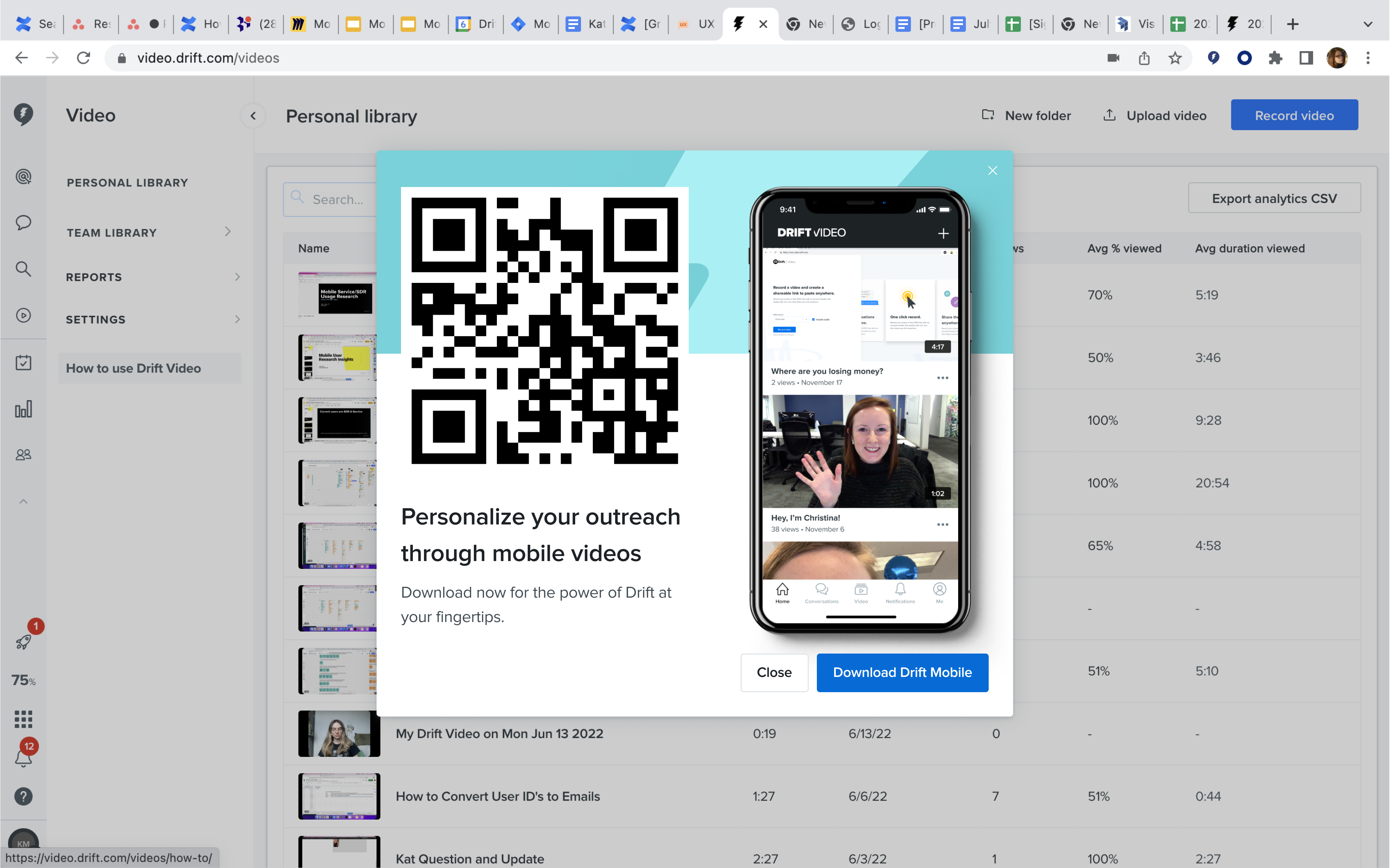
Video Library
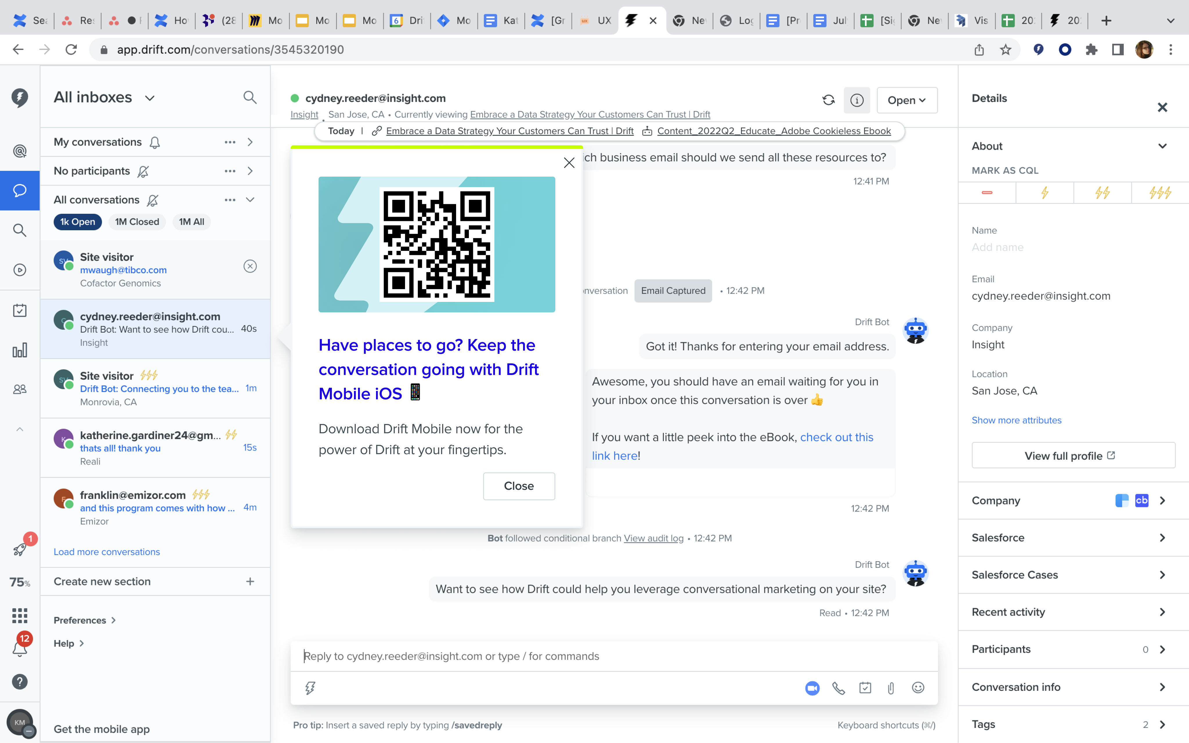
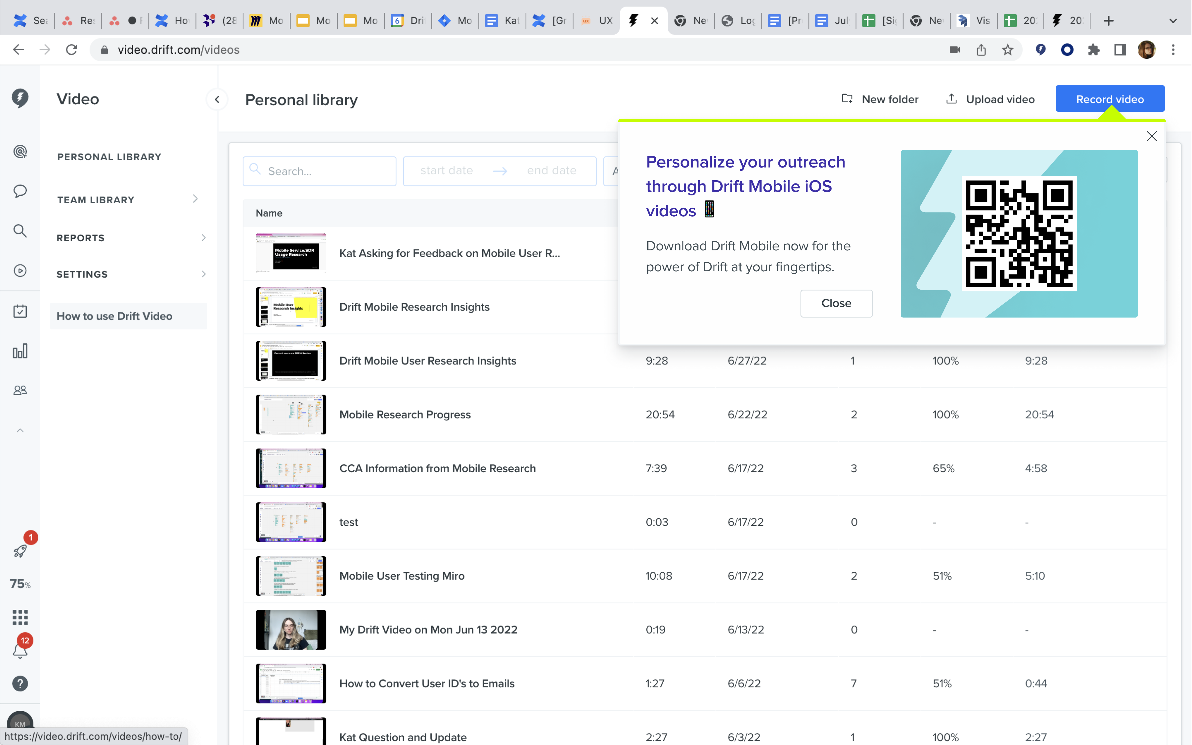
Typically, when Drift has announcement for Mobile, they use a full-screen advertisement with a QR code. However, this approach can be intrusive, and it's probable that users may swiftly dismiss these ads without giving them a second thought. I demonstrated how these advertisements would appear within the Feed, Chat, and Videos page. My objective was to show that you can complete the same parts of your workflow on Drift Desktop on Drift Mobile.
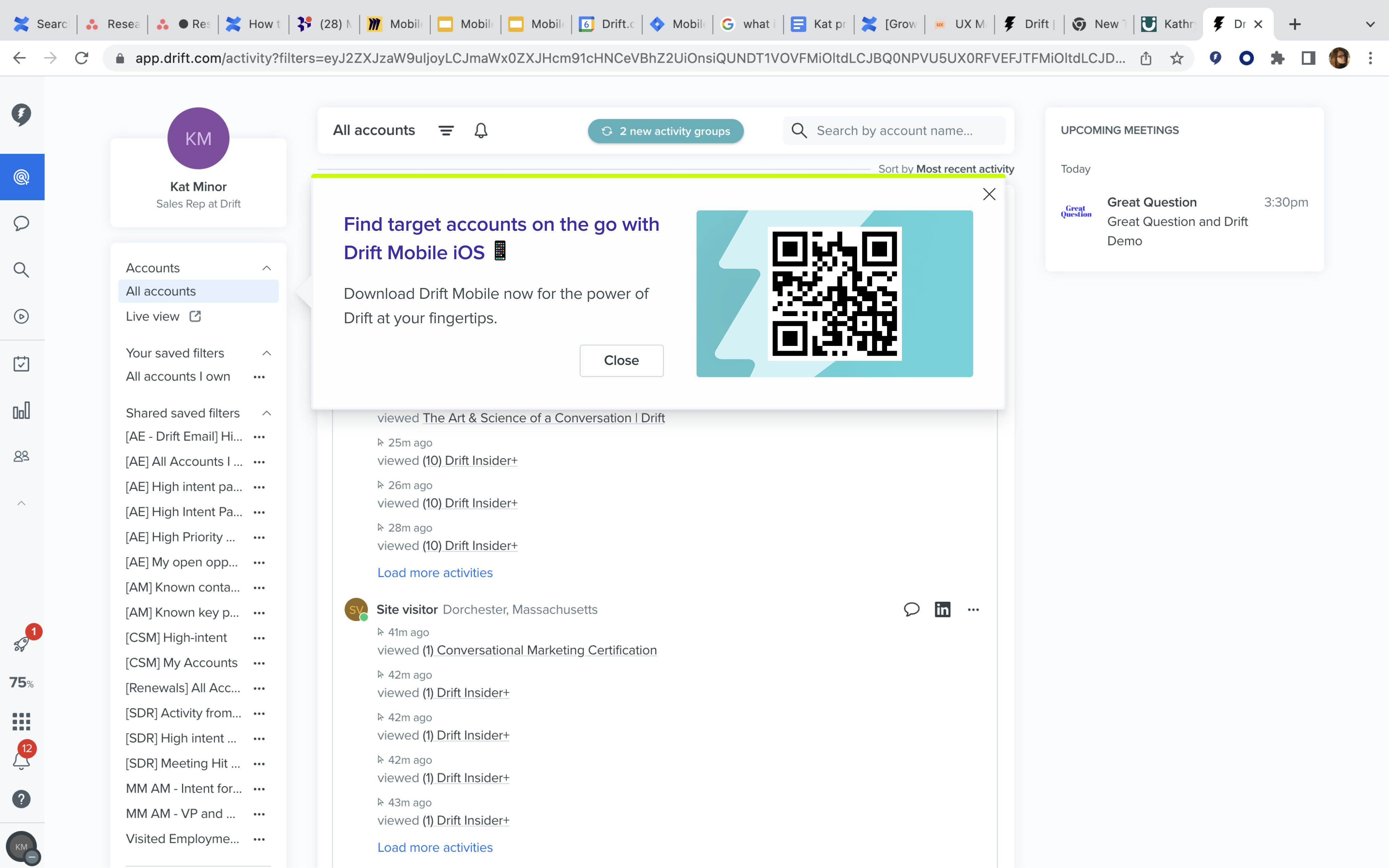
The Feed
Conversations
Video Library
I designed a set of tooltips as an alternative to the full-page ads, aiming for a less intrusive user experience. My intention was for users to pause briefly and read these tooltips, gaining an understanding that the actions available on desktop are equally accessible on mobile. Tooltips are commonly employed to provide Drift users with insights on how to optimize their product usage, making them a suitable choice for conveying this information.
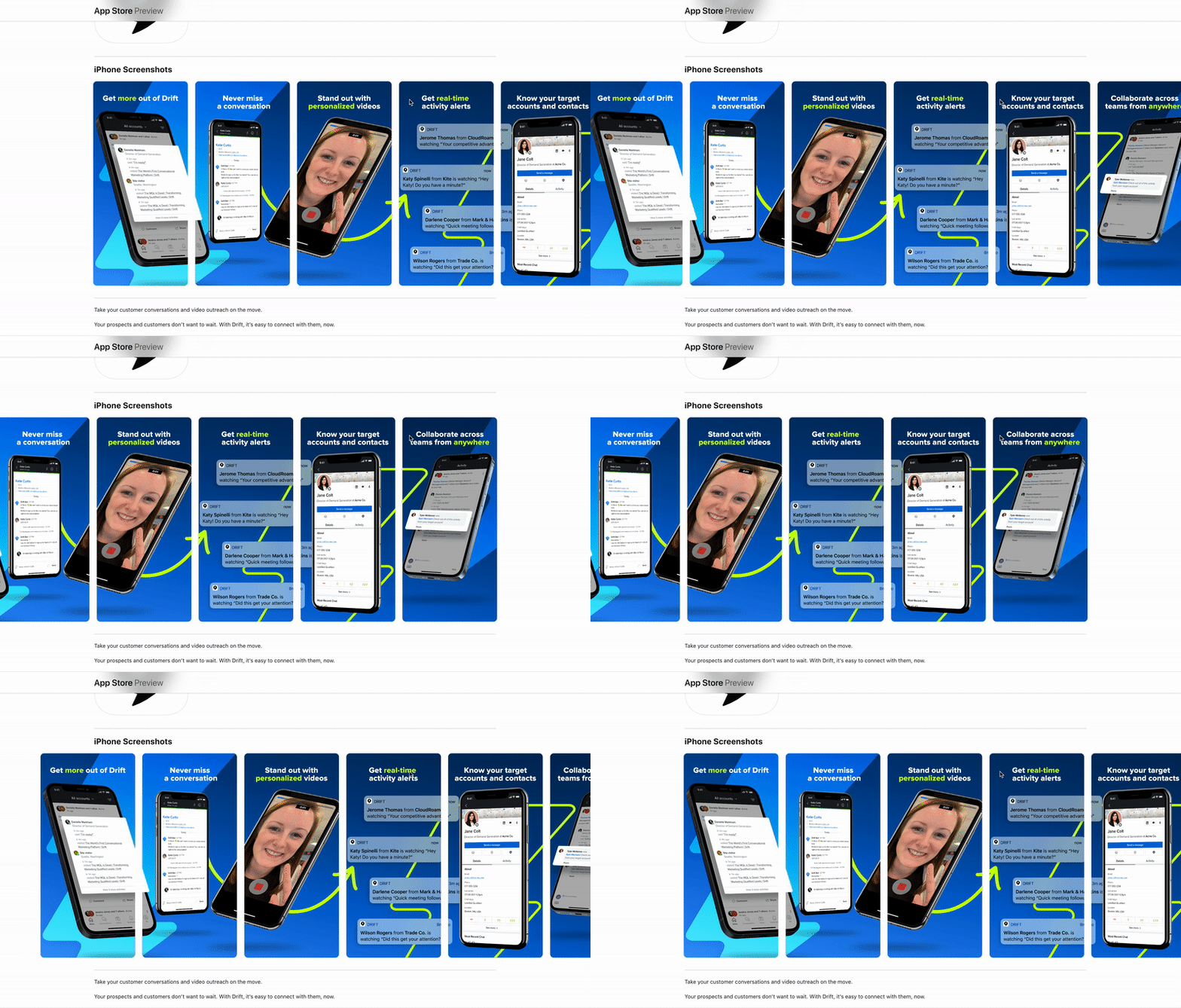
I also developed an updated app store preview because the previous one lacked current branding and showcased outdated features. This updated preview allowed individuals to know that they were downloading the correct and up-to-date app.
My experience with Drift Mobile taught me the importance of considering the context in which mobile apps are used. Users often turn to the mobile app for quick access to smaller interactions. This led me to adopt a mindset centered around speed and efficiency, focusing on reducing the number of clicks and the time required for users to reach their desired page/feature. This newfound mentality will undoubtedly influence my approach in future projects, emphasizing user-centric design that caters to the specific needs of mobile users.
It was so helpful to have usage data to help me define the core features! Due to this, I spent considerable amount of time refining 'saved replies' and 'slash commands' since they were expected to be heavily used. While I initially iterated on 'saved replies' for mobile, I made it so that users could create their own saved replies on mobile. However, I later realized it might not be a common mobile feature. This experience reinforced my belief in prioritizing high-impact features, which I plan to apply in future projects.
Initially, Drift Mobile was very limited. Certain components that were required for designing Drift Mobile did not exist. To address this gap, I undertook the task of creating these components and then incorporated the new mobile components into the Design System for future designers. This process provided valuable insights into how to transition user experiences from desktop to mobile. I believe that this knowledge will prove beneficial in future designs.
